Africa wealthh![]()
MONEY
Map: Which Cities Hold Africa’s Wealth?
Published
2 years agoon
September 28, 2018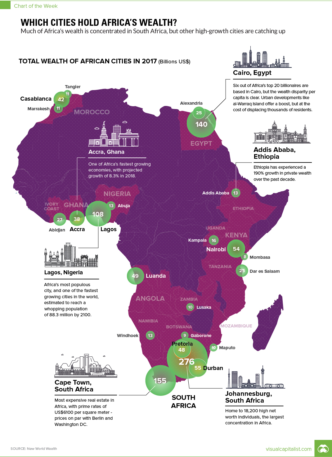
Mapping Africa’s Wealth
The Chart of the Week is a weekly Visual Capitalist feature on Fridays.
The economy in Africa is on the rise, and financial hubs are beginning to emerge.
While the resource-rich African continent has seen only 13% growth in total private wealth over the past 10 years, the 3% spike in the past year alone indicates the growth is just warming up. Africa will also be home to 13 out of the 20 of the world’s largest megacities by 2100.
In this week’s chart, we take a look at Africa’s wealthiest cities, courtesy of this recent 2018 report from New World Wealth and AfrAsia Bank.
Africa’s Evolving Economy
While Africa has traditionally played a minor role in the world market, the continent is coming into its own as a hub for financial services and entrepreneurship.
Africa’s growing elite has added 19,000 millionaires over the past decade, with total private wealth totaling $2.3 trillion. These figures are predicted to increase by 34% over the next decade, reaching $3.1 trillion by the end of 2027.
The five wealthiest cities hail from three countries:
1. Johannesburg, South Africa ($276 billion)
Founded in the Witwatersrand Gold Rush of 1886, South Africa’s City of Gold is a hub for financial services, professional services (law firms and consultancies), construction, telecommunications, and basic materials.
2. Cape Town, South Africa ($155 billion)
One of South Africa’s three capital cities, Cape Town’s major sectors include real estate, financial services, retail, and tourism. Cape Town has the highest prime residential rates on the continent at US$6,100 per square meter, similar to cities such as Washington, D.C., or Berlin.
3. Cairo, Egypt ($140 billion)
A hub for Africa and the Middle East, Cairo’s major sectors include real estate, construction, financial services, and basic materials.
4. Lagos, Nigeria ($108 billion)
The clearing house for 80% of Nigeria’s imports, major sectors include basic materials, real estate, construction, telecommunications, transport, and financial services.
5. Durban, South Africa ($55 billion)
Home to the biggest shopping center in Africa – complete with 350 stores, 70 restaurants, 18 movie theaters, an IMAX theater, an indoor climbing wall, and a skate park designed by Tony Hawk – Durban’s major sectors include real estate, finance, healthcare, construction, retail, and transport.
The Full List of Cities
Here is a full ranking of the top 23 cities in Africa, based on New World Wealth’s data.
| Rank | City | Country | Total Private Wealth (USD) |
|---|---|---|---|
| #1 | Johannesburg | South Africa | $276 billion |
| #2 | Cape Town | South Africa | $155 billion |
| #3 | Cairo | Egypt | $140 billion |
| #4 | Lagos | Nigeria | $108 billion |
| #5 | Durban | South Africa | $55 billion |
| #6 | Nairobi | Kenya | $54 billion |
| #7 | Luanda | Angola | $49 billion |
| #8 | Pretoria | South Africa | $48 billion |
| #9 | Casablanca | Morocco | $42 billion |
| #10 | Accra | Ghana | $38 billion |
| #11 | Abidjan | Côte d'Ivoire | $27 billion |
| #12 | Dar es Salaam | Tanzania | $25 billion |
| #13 | Alexandria | Egypt | $25 billion |
| #14 | Kampala | Uganda | $16 billion |
| #15 | Windhoek | Namibia | $13 billion |
| #16 | Abuja | Nigeria | $13 billion |
| #17 | Addis Ababa | Ethiopia | $13 billion |
| #18 | Marrakesh | Morocco | $11 billion |
| #19 | Tangier | Morocco | $11 billion |
| #20 | Lusaka | Zambia | $10 billion |
| #21 | Maputo | Mozambique | $10 billion |
| #22 | Gaborone | Botswana | $9 billion |
| #23 | Mombasa | Kenya | $8 billion |
With a growth trajectory on the rise and renewed interest in African investment, what will Africa’s economy look like ten years from now?

YOU MAY LIKE


POLITICS
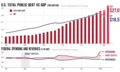
Charting America’s Debt: $27 Trillion and Counting
America’s debt recently surpassed $27 trillion. In this infographic, we peel back the layers to understand why it keeps on growing.
Published
4 days agoon
October 30, 2020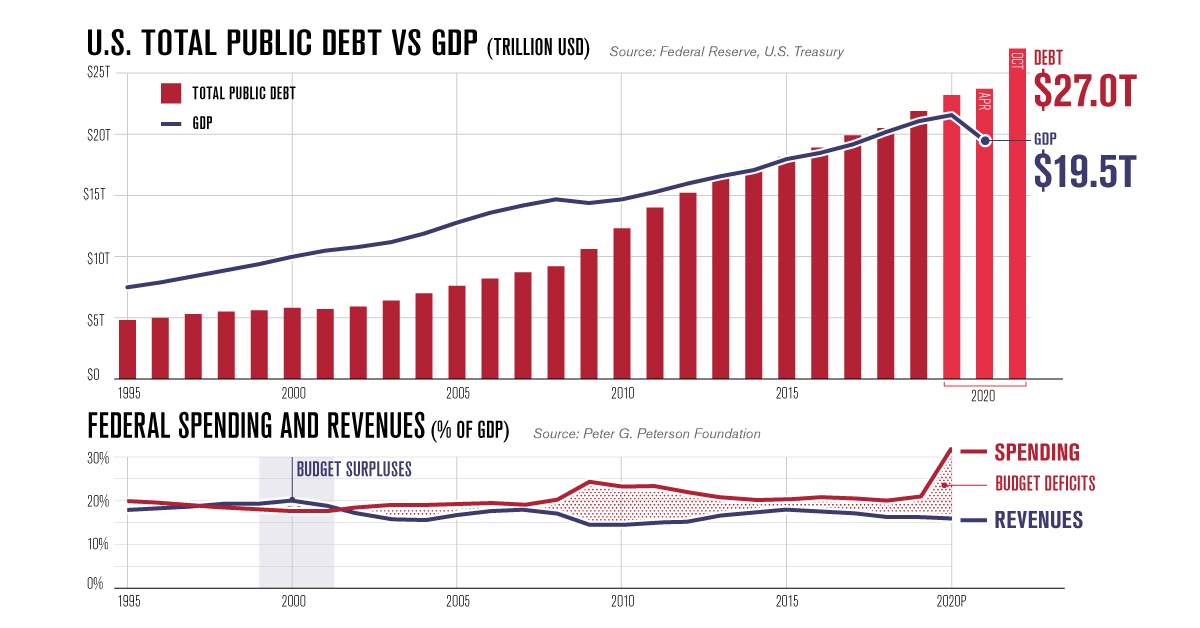
Why America’s Debt Doesn’t Stop Growing
Public sector debt has been a contentious topic for many years. While some believe that excessive government borrowing can be harmful over the long term, others have argued that it acts as a powerful tool for stimulating growth.
In the U.S., the latter view appears to have taken hold. Since 2008, America’s national debt has surged nearly 200%, reaching $27 trillion as of October 2020. To gain a better understanding of this ever-growing debt, this infographic takes a closer look at various U.S. budgetary datasets including the 2019 fiscal balance.
America’s Debt vs. GDP
Government debts are often represented by incredibly large numbers, making them hard to comprehend. By comparing America’s debt to its annual GDP, we can get a better grasp on the relative size of the country’s financial obligations.
| Year | Total Public Debt (USD) | GDP (USD) | Debt as % of GDP |
|---|---|---|---|
| 1994 | $4.5T | $7.1T | 63% |
| 1995 | $4.8T | $7.5T | 64% |
| 1996 | $5.0T | $7.9T | 63% |
| 1997 | $5.3T | $8.4T | 63% |
| 1998 | $5.5T | $8.9T | 62% |
| 1999 | $5.6T | $9.4T | 60% |
| 2000 | $5.8T | $10.0T | 58% |
| 2001 | $5.7T | $10.5T | 54% |
| 2002 | $5.9T | $10.8T | 55% |
| 2003 | $6.4T | $11.2T | 57% |
Source: Federal Reserve, U.S. Treasury
In this context, U.S. debt was relatively moderate between 1994 to 2007, averaging 60% of GDP over the timeframe. This took a drastic turn during the Global Financial Crisis, with debt climbing to 95% of GDP by 2012.
Since then, America’s debt has only increased in relative size. In April 2020, with the COVID-19 pandemic in full force, it reached a record 122% of GDP. This may sound troubling at first, but there are a few caveats.
For starters, there are many other advanced economies that have also surpassed the 100% debt-to-GDP milestone. The most noteworthy is Japan, where the debt-to-GDP ratio has climbed beyond 200%. Furthermore, this is not the first time America has found itself in this situation—by the end of World War II, debt-to-GDP peaked at 106% before declining to historic lows in the 1970s.
What’s Preventing the Debt From Shrinking?
Although the U.S. continuously pays off portions of its debt, the total amount it owes has increased each year since 2001. That’s because the federal government runs consistent budget deficits, meaning it spends more than it earns. During economic crises, these deficits can become incredibly large.
| Fiscal Year (Sept 30) | Budget Surplus or Deficit (USD billions) |
|---|---|
| 2000 | +$236B |
| 2001 | +$128B |
| 2002 | -$158B |
| 2003 | -$378B |
| 2004 | -$418B |
Source: Federal Reserve
In the aftermath of the Global Financial Crisis, the U.S. recorded an annual deficit of $1.4 trillion in FY2009. This was largely due to the $787 billion American Recovery and Reinvestment Act of 2009, which provided tax rebates and other economic relief.
In the economic battle against COVID-19’s impacts, the boundaries have been pushed even further. The annual deficit for FY2020 weighs in at a staggering $3.1 trillion, the largest ever. Contributing to this historic deficit was the $2 trillion CARES Act, which provided wide-ranging support to the entire U.S. economy.
Breaking Down the 2019 Fiscal Balance
Even in the years between these two economic crises, government spending still outpaced revenues. To find out more, we’ve broken down the 2019 fiscal balance into its various components.
Federal Spending
Total spending in FY2019 was roughly $4.4 trillion, and can be broken out into three components.
The first component is Mandatory Spending, which accounted for 62% of the total. Mandatory spending is required by law, and includes funding for important programs such as social security.
| Category | Amount (USD billions) | Percent of Total Federal Spending |
|---|---|---|
| Health programs | $1,121B | 25.5% |
| Social security | $1,039B | 23.6% |
| Income security | $301B | 6.8% |
| Federal civilian and military retirement | $164B | 3.7% |
| Other | $109B | 2.5% |
| Total mandatory spending | $2,735B | 62.2% |
Figures may not add to 100 due to rounding. Source: Peter G. Peterson Foundation
The largest category here was Health, with $1.1 trillion in funding for programs such as Medicare and Medicaid. Social security, which provides payments to retirees, was the second largest at $1.0 trillion.
The second component is Discretionary Spending, which accounted for 30% of the total. Discretionary spending is determined on an annual basis by Congress and the President.
| Discretionary Spending | Amount (USD) | Share of Total Federal Spending |
|---|---|---|
| Defense | $677B | 15.4% |
| Transportation | $100B | 2.3% |
| Veteran's benefits & services | $85B | 1.9% |
| Education | $72B | 1.6% |
| Health | $66B | 1.5% |
Figures may not add to 100 due to rounding. Source: Peter G. Peterson Foundation
At $677 billion, the Defense category represents over half of total discretionary spending. These funds are spread across the five branches of the U.S. military: the Army, Marine Corps, Navy, Air Force, and Space Force.
The third component of spending is the net interest costs on existing government debt. For FY2019, this was approximately $327 billion.
Federal Revenues
Revenues in FY2019 fell short of total spending, coming in at approximately $3.5 trillion. These inflows can be traced back to six categories.
| Category | Amount (USD billions) | Percent of Total Revenues |
|---|---|---|
| Individual income taxes | $1,732B | 50.0% |
| Payroll taxes | $1,247B | 36.0% |
| Corporate income taxes | $242B | 7.0% |
| Other | $104B | 3.0% |
| Excise taxes | $104B | 3.0% |
| Customs duties | $69B | 2.0% |
| Total revenues | $3,464B | 100.0% |
Figures may not add to 100 due to rounding. Source: Peter G. Peterson Foundation
Revenues overwhelmingly relied on individual income and payroll taxes, which together, accounted for 86% of the total. Corporate income taxes, on the other hand, accounted for just 7%.
Is America’s Debt a Cause for Concern?
The general consensus following the events of 2008 is that large fiscal stimulus (supported by government borrowing) was effective in speeding up the consequent recovery.
Now facing a pandemic, it’s likely that many Americans would support the idea of running large deficits to boost the economy. Surveys released in July 2020, for example, found that 82% of Americans wanted federal relief measures to be extended.
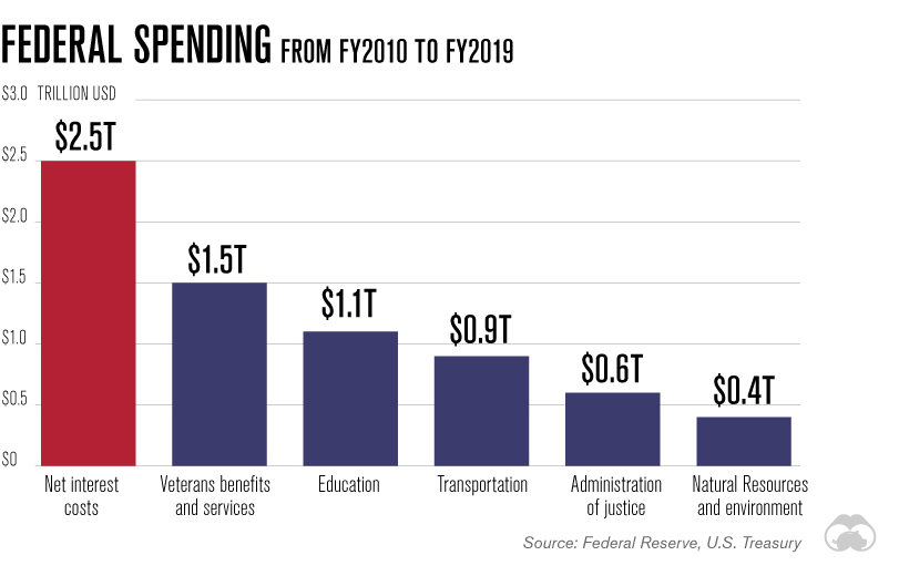
Looking beyond COVID-19, however, does reveal some warning signs. One frequent criticism of the ever-growing national debt is its associated interest costs, which could cannibalize investment in other areas. In fact, the effects of this dilemma are already becoming apparent. Over the past decade, the U.S. has spent more on interest than it has on programs such as veterans benefits and education.
With low interest rates expected for the foreseeable future, the federal government is likely to continue running its large annual deficits—at least until the effects of COVID-19 have fully subsided. Perhaps after this crisis is over, it will be time to assess the long-term sustainability of America’s rising national debt.

GOLD
Comparing Recent U.S. Presidents: New Debt Added vs. Precious Metals Production
While gold and silver coin production during U.S. presidencies has declined, public debt continues to climb to historically high levels.
Published
5 days agoon
October 29, 2020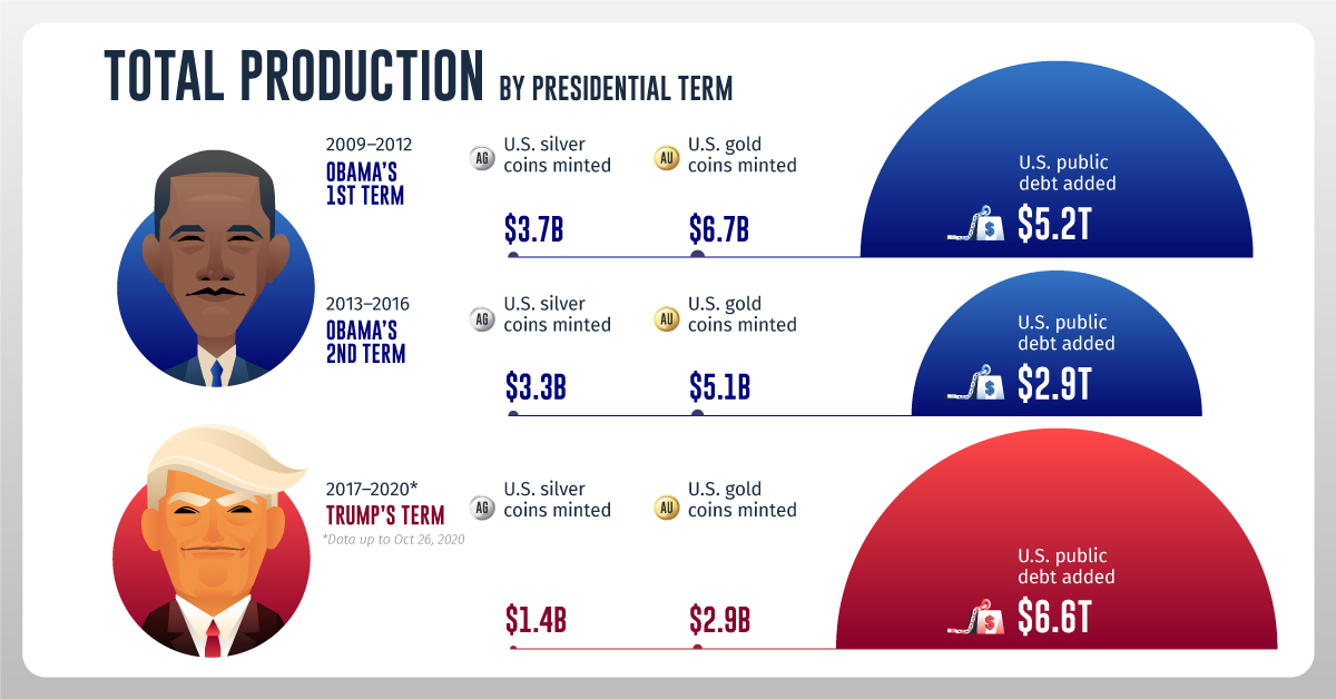
Recent U.S. Presidents: Debt vs. Coins Added
While precious metals can’t be produced out of thin air, U.S. debt can be financed through central bank money creation. In fact, U.S. debt has skyrocketed in recent years under both Democrat and Republican administrations.
This infographic from Texas Precious Metals compares the increase in public debt to the value of gold and silver coin production during U.S. presidencies.
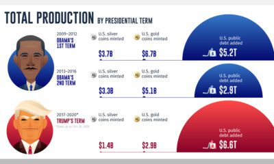
Total Production by Presidential Term
We used U.S. public debt in our calculations, a measure of debt owed to third parties such as foreign governments, corporations, and individuals, while excluding intragovernmental holdings. To derive the value of U.S. minted gold and silver coins, we multiplied new ounces produced by the average closing price of gold or silver in each respective year.
Here’s how debt growth stacks up against gold and silver coin production during recent U.S. presidencies:
| Obama's 1st term (2009-2012) | Obama's Second Term (2013-2016) | Trump's term (2017-Oct 26 2020) | |
|---|---|---|---|
| U.S. Silver Coins Minted | $3.7B | $3.3B | $1.4B |
| U.S. Gold Coins Minted | $6.7B | $5.1B | $2.9B |
| U.S. Public Debt Added | $5.2T | $2.9T | $6.6T |
Over each consecutive term, gold and silver coin production decreased. In Trump’s term so far, the value of public debt added to the system is almost 1,600 times higher than minted gold and silver coins combined.
During Obama’s first term and Trump’s term, debt saw a marked increase as the administrations provided fiscal stimulus in response to the global financial crisis and the COVID-19 pandemic. As we begin to recover from COVID-19, what might debt growth look like going forward?
U.S. Public Debt Projections
As of September 30, 2020, the end of the federal government’s fiscal year, debt had reached $21 trillion. According to estimates from the Congressional Budget Office, it’s projected to rise steadily in the future.
| 2021P | 2022P | 2023P | 2024P | 2025P | 2026P | 2027P | 2028P | 2029P | 2030P | |
|---|---|---|---|---|---|---|---|---|---|---|
| U.S. Public Debt | 21.9T | 23.3T | 24.5T | 25.7T | 26.8T | 27.9T | 29.0T | 30.4T | 31.8T | 33.5T |
| Debt-to-GDP ratio | 104.4% | 105.6% | 106.7% | 107.1% | 107.2% | 106.7% | 106.3% | 106.8% | 107.4% | 108.9% |
By 2030, debt will have risen by over $12 trillion from 2020 levels and the debt-to-GDP ratio will be almost 109%.
It’s worth noting that debt will likely grow substantially regardless of who is elected in the 2020 U.S. election. Central estimates by the Committee for a Responsible Federal Budget show debt rising by $5 trillion under Trump and $5.6 trillion under Biden through 2030. These estimates exclude any COVID-19 relief policies.
What Could This Mean for Investors?
As the U.S. Federal Reserve creates more money to finance rising government debt, inflation could eventually be pushed higher. This could affect the value of the U.S. dollar.
On the flip side, gold and silver have a limited supply and coin production has decreased over the last three presidential terms. Both can act as an inflation hedge, while playing a role in wealth preservation.

SUBSCRIBE
POPULAR
 AGRICULTURE1 week ago
The Economics of Coffee in One Chart
 POLITICS4 days ago
Charting America’s Debt: $27 Trillion and Counting
 TECHNOLOGY2 months ago
Here’s What Happens Every Minute on the Internet in 2020
 MISC4 days ago
The 50 Highest Cities in the World
 GOLD5 days ago
Comparing Recent U.S. Presidents: New Debt Added vs. Precious Metals Production
 TECHNOLOGY2 weeks ago
Mapped: The Top Female Founder in Each Country
 AGRICULTURE6 days ago
Cocoa: A Bittersweet Supply Chain
 MISC1 month ago
29 Psychological Tricks To Make You Buy More
No comments:
Post a Comment